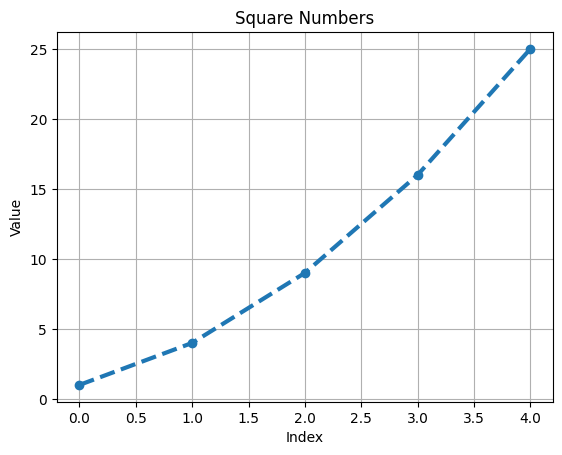
import matplotlib.pyplot as plt
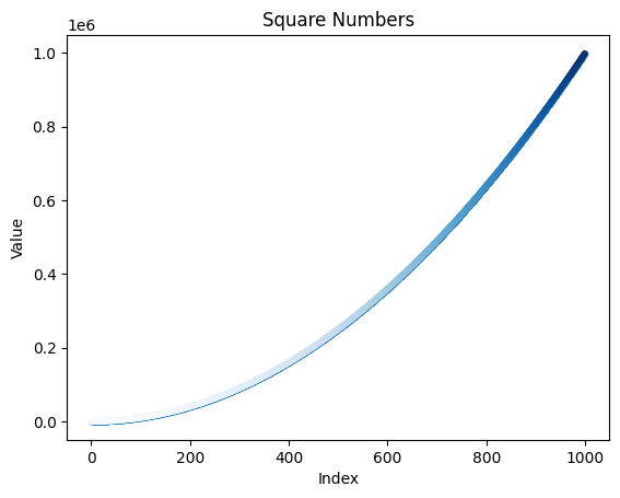
squares = [1, 4, 9, 16, 25]
# Create a figure and axis
fig, ax = plt.subplots()
# Plot the squares with a blue line
ax.plot(squares, linewidth=3, marker='o', linestyle='--')
# Customize the plot
ax.set_title('Square Numbers')
ax.set_xlabel('Index')
ax.set_ylabel('Value')
ax.grid(True)
# Show the plot
plt.show()