Code
import matplotlib.pyplot as plt
import numpy as np
import pandas as pdimport matplotlib.pyplot as plt
import numpy as np
import pandas as pdx = [0,1,2,3,4]
y = [0,2,4,6,8]
# Resize your Graph (dpi specifies pixels per inch. When saving probably should use 300 if possible)
plt.figure(figsize=(8,5), dpi=100)
# Line 1
# Keyword Argument Notation
#plt.plot(x,y, label='2x', color='red', linewidth=2, marker='.', linestyle='--', markersize=10, markeredgecolor='blue')
# Shorthand notation
# fmt = '[color][marker][line]'
plt.plot(x,y, 'b^--', label='2x')
## Line 2
# select interval we want to plot points at
x2 = np.arange(0,4.5,0.5)
# Plot part of the graph as line
plt.plot(x2[:6], x2[:6]**2, 'r', label='X^2')
# Plot remainder of graph as a dot
plt.plot(x2[5:], x2[5:]**2, 'r--')
# Add a title (specify font parameters with fontdict)
plt.title('Our First Graph!', fontdict={'fontname': 'Comic Sans MS', 'fontsize': 20})
# X and Y labels
plt.xlabel('X Axis')
plt.ylabel('Y Axis')
# X, Y axis Tickmarks (scale of your graph)
plt.xticks([0,1,2,3,4,])
#plt.yticks([0,2,4,6,8,10])
# Add a legend
plt.legend()
# Save figure (dpi 300 is good when saving so graph has high resolution)
plt.savefig('mygraph.png', dpi=300)
# Show plot
plt.show()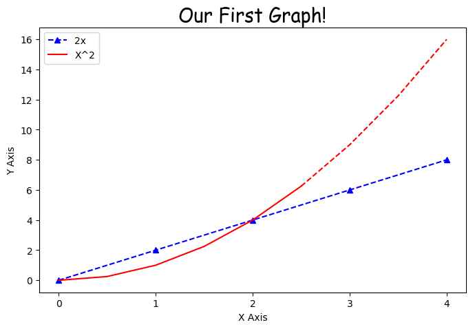
labels = ['A', 'B', 'C']
values = [1,4,2]

plt.figure(figsize=(5,3), dpi=100)

bars = plt.bar(labels, values)

patterns = ['/', 'O', '*']
for bar in bars:
    bar.set_hatch(patterns.pop(0))

plt.savefig('barchart.png', dpi=300)

plt.show()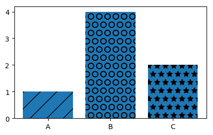
Download data from his Github (gas_prices.csv & fifa_data.csv)
gas = pd.read_csv('gas_prices.csv')

plt.figure(figsize=(8,5))

plt.title('Gas Prices over Time (in USD)', fontdict={'fontweight':'bold', 'fontsize': 18})

plt.plot(gas.Year, gas.USA, 'b.-', label='United States')
plt.plot(gas.Year, gas.Canada, 'r.-')
plt.plot(gas.Year, gas['South Korea'], 'g.-')
plt.plot(gas.Year, gas.Australia, 'y.-')

# Another Way to plot many values!
# countries_to_look_at = ['Australia', 'USA', 'Canada', 'South Korea']
# for country in gas:
#     if country in countries_to_look_at:
#         plt.plot(gas.Year, gas[country], marker='.')

plt.xticks(gas.Year[::3].tolist()+[2011])

plt.xlabel('Year')
plt.ylabel('US Dollars')

plt.legend()

plt.savefig('Gas_price_figure.png', dpi=300)

plt.show()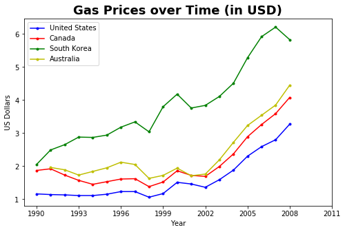
fifa = pd.read_csv('fifa_data.csv')

fifa.head(5)| Unnamed: 0 | ID | Name | Age | Photo | Nationality | Flag | Overall | Potential | Club | ... | Composure | Marking | StandingTackle | SlidingTackle | GKDiving | GKHandling | GKKicking | GKPositioning | GKReflexes | Release Clause | |
|---|---|---|---|---|---|---|---|---|---|---|---|---|---|---|---|---|---|---|---|---|---|
| 0 | 0 | 158023 | L. Messi | 31 | https://cdn.sofifa.org/players/4/19/158023.png | Argentina | https://cdn.sofifa.org/flags/52.png | 94 | 94 | FC Barcelona | ... | 96.0 | 33.0 | 28.0 | 26.0 | 6.0 | 11.0 | 15.0 | 14.0 | 8.0 | €226.5M |
| 1 | 1 | 20801 | Cristiano Ronaldo | 33 | https://cdn.sofifa.org/players/4/19/20801.png | Portugal | https://cdn.sofifa.org/flags/38.png | 94 | 94 | Juventus | ... | 95.0 | 28.0 | 31.0 | 23.0 | 7.0 | 11.0 | 15.0 | 14.0 | 11.0 | €127.1M |
| 2 | 2 | 190871 | Neymar Jr | 26 | https://cdn.sofifa.org/players/4/19/190871.png | Brazil | https://cdn.sofifa.org/flags/54.png | 92 | 93 | Paris Saint-Germain | ... | 94.0 | 27.0 | 24.0 | 33.0 | 9.0 | 9.0 | 15.0 | 15.0 | 11.0 | €228.1M |
| 3 | 3 | 193080 | De Gea | 27 | https://cdn.sofifa.org/players/4/19/193080.png | Spain | https://cdn.sofifa.org/flags/45.png | 91 | 93 | Manchester United | ... | 68.0 | 15.0 | 21.0 | 13.0 | 90.0 | 85.0 | 87.0 | 88.0 | 94.0 | €138.6M |
| 4 | 4 | 192985 | K. De Bruyne | 27 | https://cdn.sofifa.org/players/4/19/192985.png | Belgium | https://cdn.sofifa.org/flags/7.png | 91 | 92 | Manchester City | ... | 88.0 | 68.0 | 58.0 | 51.0 | 15.0 | 13.0 | 5.0 | 10.0 | 13.0 | €196.4M |
5 rows × 89 columns
bins = [40,50,60,70,80,90,100]

plt.figure(figsize=(8,5))

plt.hist(fifa.Overall, bins=bins, color='#abcdef')

plt.xticks(bins)

plt.ylabel('Number of Players')
plt.xlabel('Skill Level')
plt.title('Distribution of Player Skills in FIFA 2018')

plt.savefig('histogram.png', dpi=300)

plt.show()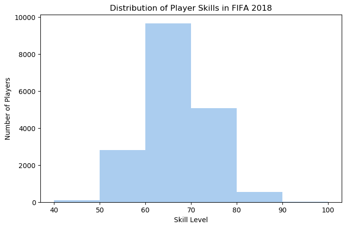
left = fifa.loc[fifa['Preferred Foot'] == 'Left'].count()[0]
right = fifa.loc[fifa['Preferred Foot'] == 'Right'].count()[0]

plt.figure(figsize=(8,5))

labels = ['Left', 'Right']
colors = ['#abcdef', '#aabbcc']

plt.pie([left, right], labels = labels, colors=colors, autopct='%.2f %%')

plt.title('Foot Preference of FIFA Players')

plt.show()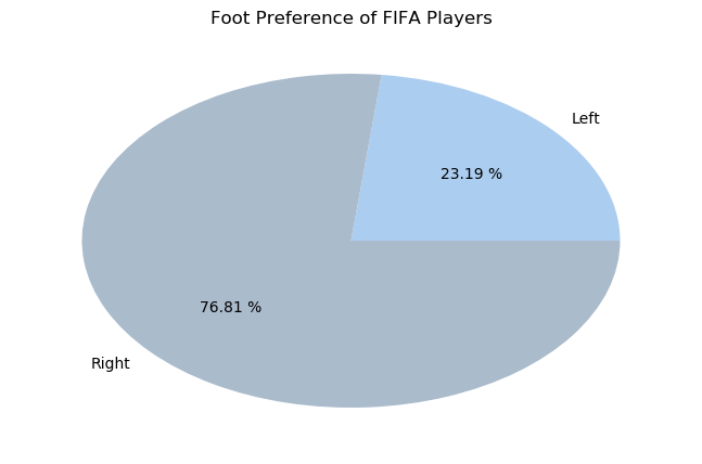
plt.figure(figsize=(8,5), dpi=100)

plt.style.use('ggplot')

fifa.Weight = [int(x.strip('lbs')) if type(x)==str else x for x in fifa.Weight]

light = fifa.loc[fifa.Weight < 125].count()[0]
light_medium = fifa[(fifa.Weight >= 125) & (fifa.Weight < 150)].count()[0]
medium = fifa[(fifa.Weight >= 150) & (fifa.Weight < 175)].count()[0]
medium_heavy = fifa[(fifa.Weight >= 175) & (fifa.Weight < 200)].count()[0]
heavy = fifa[fifa.Weight >= 200].count()[0]

weights = [light,light_medium, medium, medium_heavy, heavy]
label = ['under 125', '125-150', '150-175', '175-200', 'over 200']
explode = (.4,.2,0,0,.4)

plt.title('Weight of Professional Soccer Players (lbs)')

plt.pie(weights, labels=label, explode=explode, pctdistance=0.8,autopct='%.2f %%')
plt.show()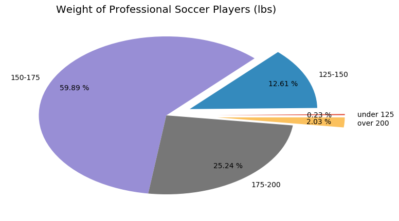
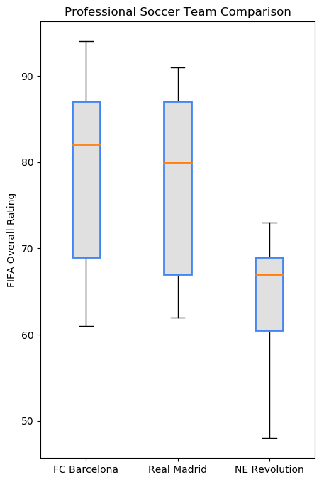
plt.figure(figsize=(5,8), dpi=100)

plt.style.use('default')

barcelona = fifa.loc[fifa.Club == "FC Barcelona"]['Overall']
madrid = fifa.loc[fifa.Club == "Real Madrid"]['Overall']
revs = fifa.loc[fifa.Club == "New England Revolution"]['Overall']

#bp = plt.boxplot([barcelona, madrid, revs], labels=['a','b','c'], boxprops=dict(facecolor='red'))
bp = plt.boxplot([barcelona, madrid, revs], labels=['FC Barcelona','Real Madrid','NE Revolution'], patch_artist=True, medianprops={'linewidth': 2})

plt.title('Professional Soccer Team Comparison')
plt.ylabel('FIFA Overall Rating')

for box in bp['boxes']:
    # change outline color
    box.set(color='#4286f4', linewidth=2)
    # change fill color
    box.set(facecolor = '#e0e0e0' )
    # change hatch
    #box.set(hatch = '/')

plt.show()